UX Writer | Content Designer
One of the projects I worked on at ACKO Insurance.
The original copy was very generic and did not highlight the company's USPs.
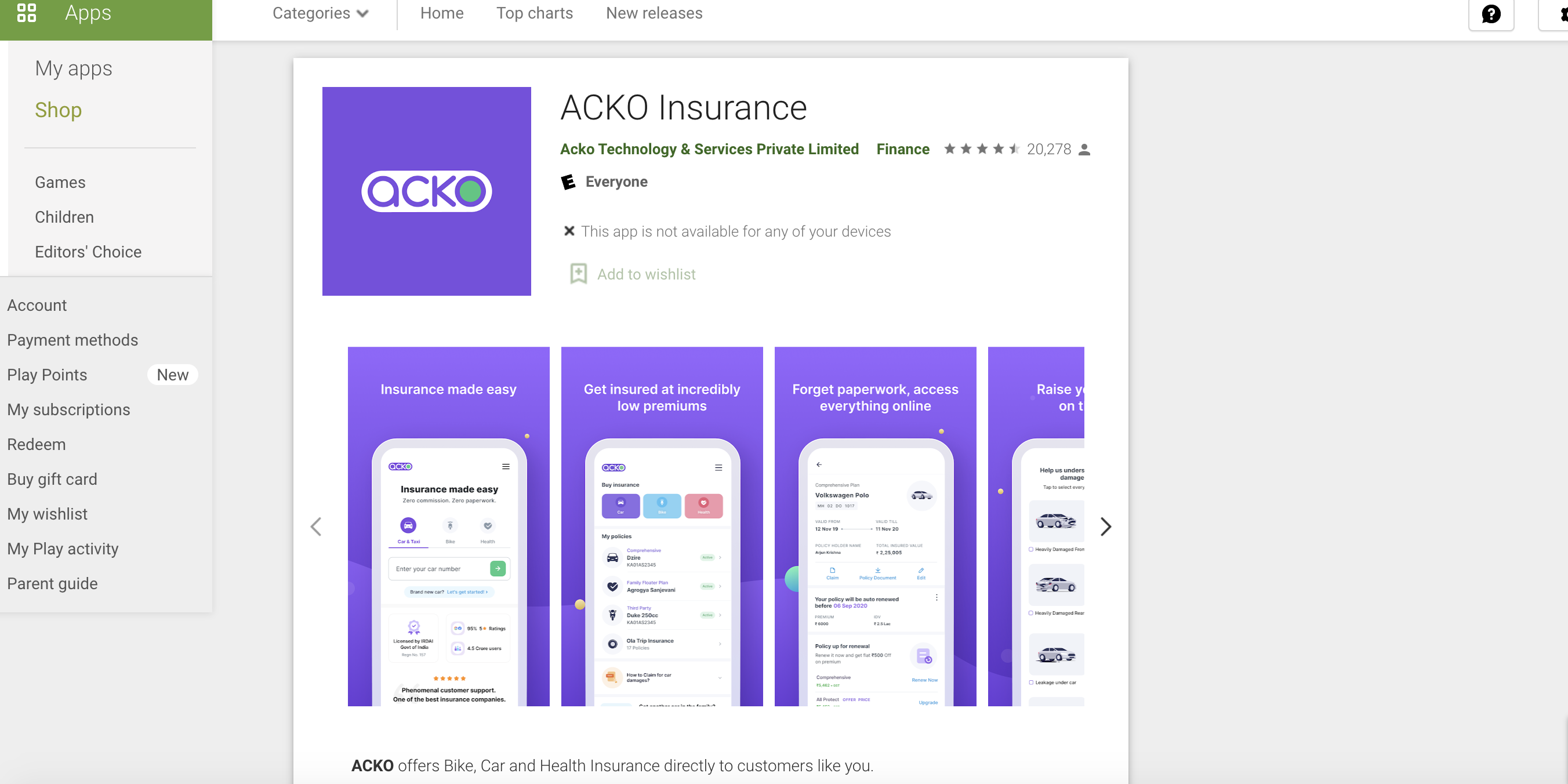
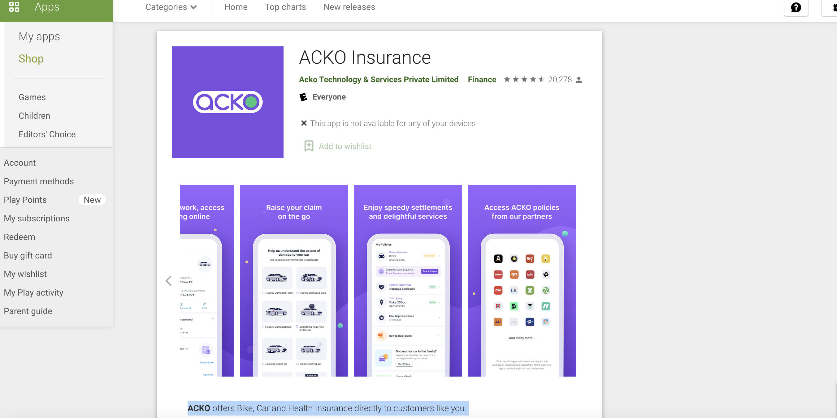
The USPs of ACKO weren't displayed in the first fold.

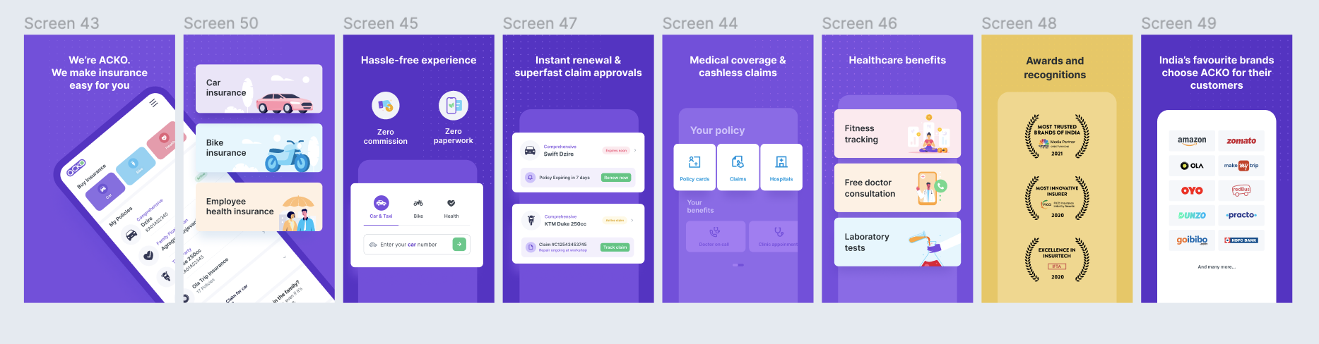
I started by clearly stating, 'We're ACKO,' to ensure that users who visit the app immediately recognise they are in the right place. I also highlighted what ACKO does – making insurance easy.
On the second screen, we introduced the new product, along with the other offerings already available from ACKO.
Following this revamp, ACKO achieved the number one ranking in the Google Play Store when users searched for the term 'Insurance'.
Introduce the company's new ‘Corporate/Employee Health Insurance’ product. Also, a redesign of the entire carousel copy is required to ensure that users who visit Google Play to download the app are aware that they have the correct app.
Develop a more streamlined, user-friendly version of ACKO's Google Play Store by emphasising the name "ACKO" and its benefits to users in the first fold. Make sure the newly launched product is explained in a very clear and simple manner.
Team: ACKO